Python Graph & Visualization
数据科学
matplotlib
基础语法与概念
plotly
matplotlib VS plotly
- matplotlib can use custom color and line style
- plotly is more easily to quickly built up.
基础语法与概念
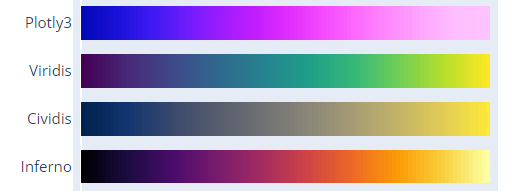
线性颜色柱的选择
https://plotly.com/python/builtin-colorscales/
same in matplotlib
plt.show 转发图像到本地
使用Dash: A web application framework for your data., 默认部署在localhost:8050端口
本地机器打通ssh隧道
1 | ssh -L 8050:127.0.0.1:8050 -vN -f -l shaojiemike 202.38.72.23 |
科研画图
In scientific research plotting, it’s always bar charts instead of line charts.
Possible reasons:
- The visual footprint of point lines is relatively small compared to bar
- Line charts are aggregated together when there is a meaningful comparison of data along the y-axis.
global setting
font things, Attention, global settings have higher priority to get work
1 |
|
layout
- picture size
1 |
- figure size (adjust x,y tick distance)
1 | # mpl |
- relative position
1 | # mpl: Adjust the left margin to make room for the legend, left & right chart vertical line position from [0,1] |
set x axis
1 | # mpl: |
set y axis
- vertical grid line
- dick size
- and range size
1 | # mpl |
Bolden Contour Lines
- Entire Figure
1 | # mpl ? |
- and Each Bar Within
1 | # mpl: Create a bar chart with bold outlines |
legend box
1 | # mpl: |
bar
1 | # mpl: white hugo hatch with black bar edge. |
Out-box text
To draw symmetry chart, we need to special highlight the overflow bar number.
If the ancher point locate in the plot box, it’s easy to show text above the ceil line using textposition="bottom" like option. In the opposite scenario, plotly and mathplotlib all will hide the out-box text.
1 | # plotly |
But mlb can write text out box.
1 | ax.text(1, -1.6, 'Increasing', ha="center") |
out-box line
mathplotlib(mpl) can achieve this using ref, but there are few blogs about plotly.
1 | # mpl: from 1*1 size full-graph (0.5,0.2) to point (1,0.8) |
in-box line
1 | # mpl: |
实践
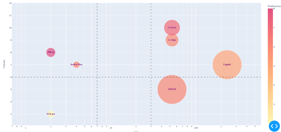
气泡图
二维无向图
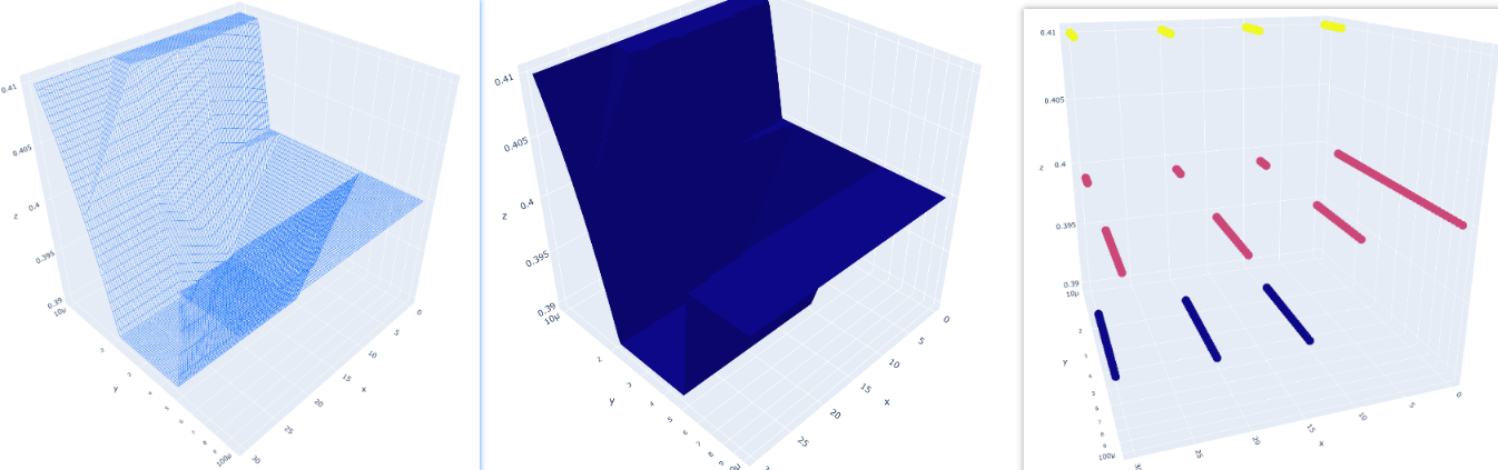
3D图
如果防火墙是关闭的,你可以直接部署在external address上。使用docker也是可行的办法
1 | app.run_server(debug=True, host='202.38.72.23') |
3D 散点图,拟合曲面与网格图
折线图
1 | import matplotlib.pyplot as plt |
Heatmap
Stacked Bar & grouped compare bar
Error Bars
在柱状图中,用于表示上下浮动的元素通常被称为“误差条”(Error Bars)。误差条是用于显示数据点或柱状图中的不确定性或误差范围的线条或线段。它们在柱状图中以垂直方向延伸,可以显示上下浮动的范围,提供了一种可视化的方式来表示数据的变化或不确定性。误差条通常通过标准差、标准误差、置信区间或其他统计指标来计算和表示数据的浮动范围。
Errorbars + StackedBars stacked 的过程中由于向上的error线的会被后面的Bar遮盖,然后下面的error线由于arrayminus=[i-j for i,j in zip(sumList,down_error)]导致大部分时间说负值,也不会显示。
1 | fig = go.Figure() |
Candlestick
类似股票上下跳动的浮标被称为”Candlestick”(蜡烛图)或”OHLC”(开盘-最高-最低-收盘)图表。
需要进一步的研究学习
暂无
遇到的问题
暂无
开题缘由、总结、反思、吐槽~~
参考文献
上面回答部分来自ChatGPT-3.5,暂时没有校验其可靠性(看上去貌似说得通)。
[1] Saket, B., Endert, A. and Demiralp, Ç., 2018. Task-based effectiveness of basic visualizations.IEEE transactions on visualization and computer graphics,25(7), pp.2505-2512.
Python Graph & Visualization
http://icarus.shaojiemike.top/2023/10/15/Work/software/visualization/pythonGraph/